The University of Texas Southwestern Medical Center
Forefront
Crafting a newsletter for alumni at the leading edge of science and medicine
Alumni can be among the most powerful advocates and supporters of an institution of higher learning. Building a new digital publication to connect this vital constituent group with The University of Texas Southwestern Medical Center required a clever mix of design approaches more commonly used in print and a steadfast eye toward sustainability, ensuring the newsletter could meet its publication commitments.
Process
Avoiding common pitfalls of template-driven design, the team instead took inspiration from magazines, creating a sense of art direction and editorial voice that remixes elements of print design to achieve a brand-forward publication with a sense of identity and institutional pride.
From a broad survey of alumni groups, two themes emerged. One, that UT Southwestern was regarded as an institution on the leading edge of science and medicine. Alumni viewed themselves as part of the vanguard and were not receiving regular updates on progress and achievements of the institution and their colleagues.

The opportunity was ripe for a digital publication to meet these needs. Capturing the spirit of advancement at the institution, the publication was named Forefront. A logo was designed that integrated condensed and expanded weights of Helvetica Neue, customizing the brand's typeface with clipped off horizontal terminals to convey a sense of momentum. An accent in the institution's bright blue highlighted the leading edge of the mark and created a signature graphic element that could serve as an additional part of the publication's brand.
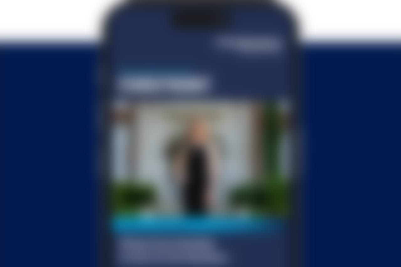
From first view, the newsletter evokes the sense of a magazine cover, uniting masthead elements of the publication logo and tagline with a portrait of an alumnus. Working within the constraints of email clients, design elements such as expressive typography, bold color, and impactful photography were thoughtfully employed to provide the reader a more refined experience. By employing common elements of print design such as gradients and drop shadows to impart a visual richness.

The use of expanded and condensed typefaces echoes classic elements of print publications, giving the design a familiarity and typographical variety rarely achieved in email design. Typographic features such as headlines, eyebrows, pull quotes, and encircled numerals provide additional layers of embellishment.

Images are used strategically for impact, conveying the editorial voice while remaining mindful of the overall message size. Their efficient use contributes to a sustainable development timeline for each issue.
For the alumni feature that opens each issue, art can range from photography to illustration, giving each issue a unique visual voice. The wide range of options also gives the designers flexibility to use the source images to their greatest impact. Portraits shot for the issue can be run in full, and when working with smaller files provided by alumni, photo illustrations and other techniques allow us to maximize the impact of the photos we receive.

The editorial strategy for the publication was equally deliberate. Three feature story placements were designed to maximize visual impact and variety.
Each issue opens with an alumni feature, Making a Difference. Combining a large art area with a classic headline and deck pairing, the story module puts alumni front and center. The editorial team selects alumni from across the institution’s academic programs. Echoing the magazine’s tagline, special consideration is placed on showcasing individuals who are leading in their sphere of influence.

Midway through each issue, Foreground emphasizes visual storytelling. Inspired by photo essays from traditional publications, this story module combines a compelling photo and caption, creating a visual break halfway through each issue. It also creates an opportunity to occasionally highlight photos from the institution’s archives, taking care to not shift focus from the publication’s eye on the future.
Closing out each issue, the Last Word is a typography-led feature. Taking cues from pull quotes in print publications, this story engages readers with a striking quote from the story, adding to the typographic and editorial variety of the issue.
Layered between each of the feature story modules are the departments, or recurring content sections, of each issue. Top Stories provides a succinct wrap-up of five notable stories from across the institution. News & Notes shares updates on alumni accomplishments, promotions, and passings. Upcoming Events gives readers an at-a-glance view of the calendar of scheduled activities.
Across each issue, the saturated design and impactful visuals engage readers, while typographic details create a varied and navigable flow. Driven by an editorial strategy that prioritizes the biggest impact stories, each issue of Forefront contributes to UT Southwestern’s renown as an institution on the leading edge, extending that reputation to its alumni.
Results
Leveraging the strongest elements of the institution's brand and complementing them with classic editorial design elements, we created a new digital publication that reinforces UT Southwestern’s position as a leader. Embracing the editorial strategy and thoughtfully implementing a content plan that played to the team's strengths, we were able to design a scalable publication that delivers high impact while prioritizing efficient resources.
The new alumni newsletter delivered on its dual goals of strengthening the connection of graduates and trainees to the institution and improving communication. Strengthened engagement has contributed to increased attendance at events, improved physician surveys for U.S. News & World Report rankings and better awareness of milestone achievements in the lives of alumni. Relaunched in 2022, it remains in publication today.
Team
-
Jay Caldwell
Designer
-
Alex Lyda
Writer
-
Jared Porter
Front-end Developer
-
Andrew Marton
Writer